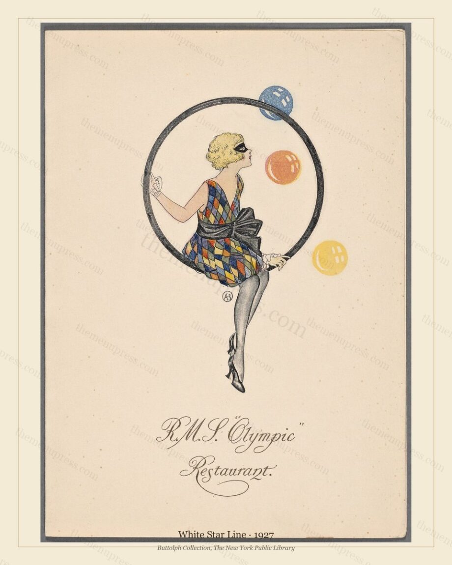
RMS Olympic 1927: The Last Year of an Art Deco Liner
TL;DR — The 1927 menu cards from the R.M.S. Olympic represent the late-career Art Deco peak of the older sister of the Titanic. Olympic entered service in 1911, survived the war as a troop ship, was rebuilt in 1919, refitted in oil-fired Art Deco style in the mid-1920s, and ran until 1935. The 1927 cards belong to the eight years when she was a working Art Deco object — modern enough to feel contemporary, old enough that the dining-room conventions from her 1911 maiden voyage were still recognisable. They are among the most-purchased single menus in the entire archive.
The Ship: A Twenty-Four Year Atlantic Career
The R.M.S. Olympic was launched at the Harland and Wolff yards in Belfast in 1910 and entered White Star Line service in June 1911 (Maxtone-Graham, 1972). She was the older of three sister ships — Olympic, Titanic, Britannic — designed as White Star’s response to the Cunard Mauretania and Lusitania. Titanic sank in April 1912; Britannic was lost in 1916 to a mine in the Aegean while serving as a hospital ship; Olympic survived everything that killed her sisters and ran transatlantic service for twenty-four years.
She was rebuilt twice. The first rebuild followed the Titanic disaster: additional lifeboats, watertight bulkheads raised, double-skinning across the engine spaces. The second came in 1919–1920 after war service as a troopship (in which capacity she rammed and sank a German U-boat, the only merchant ship to do so under her own power). The 1919–1920 work converted her boilers to oil-fired, modernised her electrical system, and updated the first-class public rooms toward what would become the inter-war Art Deco idiom.
By 1927 the Olympic had been in service sixteen years. She was, by the standards of the late 1920s North Atlantic, an older ship. The new German Bremen and the French Île de France were both faster and more architecturally fashionable. What Olympic had over them was that she felt established: her dining rooms, her smoking rooms, her library, her gymnasium — all updated through the 1919–1920 refit but still recognisably the spaces in which two decades of first-class passengers had crossed.
The 1927 Menu Programme
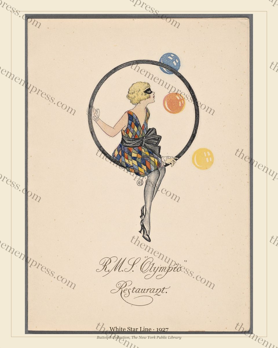
Through 1927 Olympic issued first-class dinner cards in a coherent Art Deco programme commissioned by White Star Line’s London printing department. The covers are geometric without being aggressive: a stylised composition of ship motif and wave, in two or three colours over the standard ivory card. The interior carries the dinner menu in two languages (English plus French, the French slightly more accommodating to the period’s American passengers than the formal French of the pre-war years), eight to ten courses arranged in the inter-war standard.
The 1927 cards sit in a particular sweet spot. The Edwardian saloon programme of eleven to fourteen courses had retreated; cocktails appeared on a separate card; the savoury course had quietly died; the wine list had moved to its own printed document. But the formal dinner card was still a substantial multi-page object. The 1927 issues thus capture the inter-war dining card at its mature form — before the further compression of the 1930s, when austerity and shorter meal services pushed cards down to four or five courses on a single sheet.
Reading the Cover
The 1927 cover composition has three deliberate features.
- The diagonal sweep. The visual field is partitioned by a strong diagonal — a wave, a wake, a beam of light depending on the issue — that divides the cover into roughly two parts. This is straight late-1920s Art Deco grammar and was the period’s most reliable way to communicate “modern”.
- The restrained ship motif. Where pre-war menu covers showed the ship in full broadside portrait, the 1927 cards reduce the ship to a stylised silhouette or a single funnel-and-superstructure suggestion. This is deliberate: the contemporary reading was that a literal ship portrait was an Edwardian convention. The modern card abstracted.
- The palette. Two or three colours over ivory, with the line’s heraldic red used sparingly as accent rather than dominant. Cunard was at this point still using its heraldic crest as the primary visual identifier; White Star, by contrast, was happy to set its house signal aside in favour of pure design.
Why This Specific Year
1927 cards have a particular cachet today for two reasons that compound. First, they are the last full year before the 1928 White Star Line ownership transition (the company was sold to the Royal Mail Group in late 1927; the financial collapse of Royal Mail in 1930 led directly to the 1934 Cunard–White Star merger). The 1927 issues are thus the last work fully under the original White Star management.
Second, 1927 is the year that Olympic was at her most photographically familiar. She had been on the North Atlantic for sixteen years; her cards had developed a maturity in the late Art Deco register; and her surviving published photographs from that year — ship portraits, deck scenes, dining-room interiors — are some of the most frequently reproduced images of inter-war Atlantic crossings. The 1927 menu card is the printed object most often paired with those photographs in inter-war design surveys.
After 1927
The Olympic ran through 1935. The post-1929 cards economise visibly: the print runs shorten, the cover artwork simplifies, the colour register reduces to two. By 1933 she was being kept in service largely on government insurance subsidy and tourist-class revenue. She was withdrawn in April 1935, sold for scrap, and broken up at Jarrow over 1935–1937. By the time the breakers’ yards finished with her, the line that operated her had ceased to exist as an independent entity. The 1927 menu cards represent her as she still was in the period before that decline.
The R.M.S. Olympic 1927 menu is available as an instant download in three print sizes (8×10, 11×14, 16×20) at 300 DPI, in both a pure version and a museum version with a small caption. It is among the most-purchased single cards in the archive.
Frequently Asked Questions
What is the R.M.S. Olympic’s relationship to the Titanic?
Olympic was the older sister of the Titanic, built at the same Harland & Wolff yard in Belfast, with effectively identical hull dimensions and similar first-class accommodation. She entered service in 1911 (the Titanic in April 1912); the two ships were running parallel North Atlantic schedules when the Titanic sank. Olympic outlived her sister by twenty-three years and was scrapped in 1935.
Are the 1927 cards from first class or second class?
The major surviving 1927 cards are from first-class dinner service. The interior carries the formal multi-course dinner menu in two languages. Second-class and tourist-class cards from the same year exist in fewer surviving copies and are simpler in design; the first-class material is what defines the year’s visual programme.
What size print works best?
The 16×20 inch print is the canonical statement-piece size for this card: the Art Deco composition reads cleanly at distance and anchors a back-bar or feature wall. The 11×14 inch is the standard size for a three- or four-piece chronological grouping. The 8×10 inch reads well as part of a denser gallery cluster or in an intimate space.
Further Reading
- The Golden Age of Ocean Liner Dining 1880–1930
- A History of Cunard Line Menus 1840–1934
- White Star Line Menus from Olympic to Titanic (scheduled W9 Tue)
- John Maxtone-Graham, The Only Way to Cross (Macmillan, 1972)