A History of Cunard Line Menus, 1840–1934
TL;DR — The Cunard Line ran the first scheduled North Atlantic mail-and-passenger service from 1840 and produced printed menus continuously through to its 1934 merger with White Star. Across those ninety-four years its menu design moved through four distinct phases: spare letterpress (1840–1880), heraldic embossed restraint (1880–1905), restrained illustration (1905–1920), and inter-war Art Deco (1920–1934). What unites them is a house style consistently more conservative than its German or French competitors — a deliberate position that Cunard maintained even when the visual fashion moved past it.
Founding: 1840–1880
Samuel Cunard founded the British and North American Royal Mail Steam-Packet Company in 1840 with a government contract to carry mail between Liverpool, Halifax, and Boston. The first four ships — Britannia, Acadia, Caledonia, Columbia — were wood-hulled paddle steamers with cramped saloons and dining service that was, by all surviving accounts, functional rather than pleasurable. Charles Dickens crossed on the Britannia in 1842 and complained about the food in print at length.
Menus from this earliest period survive in only a handful of copies and are almost never seen on the market. They are spare: typeset in letterpress, two columns, no illustration, no cover. The card was a working document, not a souvenir. What is notable about these early survivors is how short they are: a 1850s Cunard dinner card runs five or six courses, not the eleven or fourteen of the 1900 saloon. The transformation of the transatlantic dinner from working meal to social theatre had not yet happened.
The Heraldic Restraint Period: 1880–1905
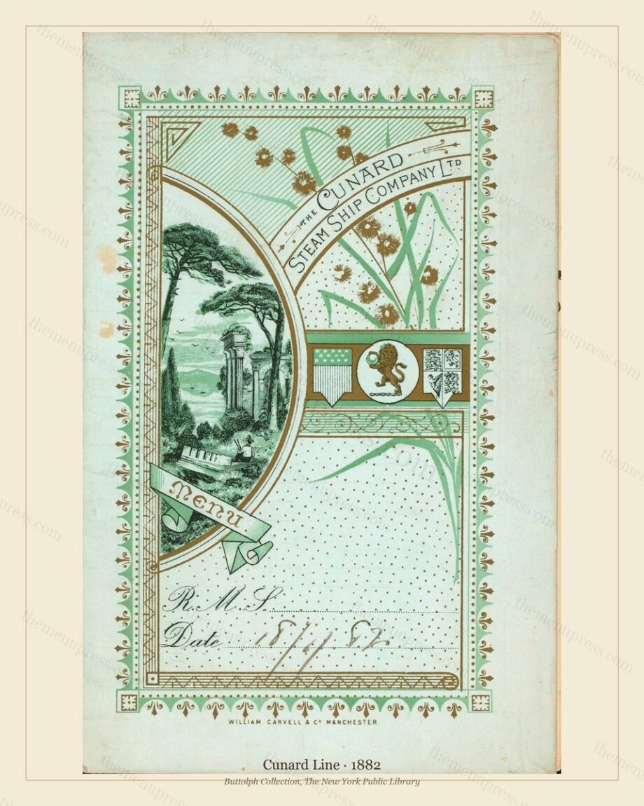
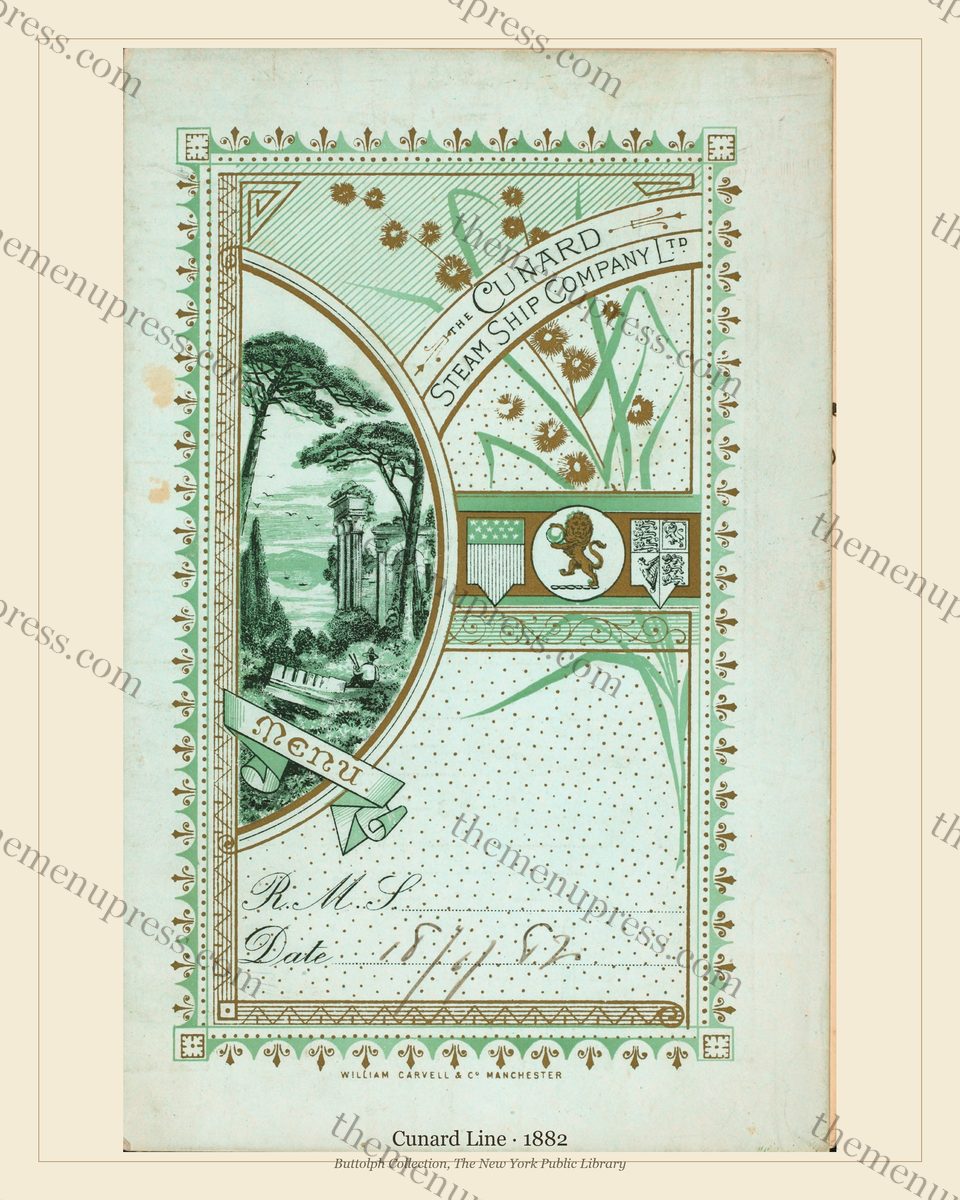
The Cunard Servia, launched in 1881, marked the visible beginning of the Cunard Golden-Age menu programme (Maxtone-Graham, 1972). The card stock thickened. The fold became standard. The two-language format (English plus French) became standard. And the cover acquired the device that would identify Cunard menus for the next quarter-century: an embossed heraldic crest, blind-stamped into the card, around which the rest of the cover composed itself.
This is the period from which the visual identity of “Cunard menu” derives. The Servia, Etruria, Umbria, Lucania, and Campania cards of the 1880s and 1890s all follow the same logic: thick ivory card, embossed crest centred near the top, restrained typography below, no illustration, no colour, no flash. The German lines were already by 1897 commissioning watercolour cover artists. Cunard was deliberately doing the opposite. The house position was that understatement was the British signal of quality, and the menu programme expressed that position card by card.
This was a commercial decision as much as an aesthetic one. Cunard had built its brand on punctuality and safety — no Cunard passenger had ever died at sea, a claim the company advertised relentlessly — and the visual tone of the menu had to align with that brand. An illustrated, watercolour menu cover would have read as a German line trying to be a magazine. The embossed crest read as a Royal Navy mess card. That, in Cunard’s reading of its first-class market, was the right signal.
Restrained Illustration: 1905–1920
By roughly 1905 Cunard had been losing market share to the German lines for nearly a decade. The visible cause was speed (Norddeutscher Lloyd’s Kaiser Wilhelm der Grosse had held the Blue Riband — the unofficial Atlantic speed record — on and off since 1897), but the underlying cause was the visible glamour of the German lines, where menu cover programmes were now genuinely impressive design objects. Cunard adjusted. From around 1905 onwards, certain Cunard menu covers began to carry colour illustration: ship portraits, port scenes, occasional decorative borders.
These covers are notably more restrained than the German equivalents. Where Hamburg-Amerika commissioned watercolour artists with named bylines, Cunard commissioned anonymous studio work, often in a single colour over a sepia base, often using ship-portrait conventions borrowed from Royal Navy print culture. The result is a body of work that is harder to assign with confidence to a named designer but that has its own coherent identity: muted, marine, almost military in restraint.
The peak of this period is the Lusitania and Mauretania programme of 1907–1914. Both ships, sister liners and Cunard’s response to the German speed challenge, produced menu cards through their first-class service that have come down in the archives as the strongest Edwardian Cunard work. The Lusitania‘s sinking in 1915 ended that particular sequence; the Mauretania continued in service until 1934.
Inter-war Art Deco: 1920–1934
After the First World War, Cunard’s position changed in two ways. Speed had stopped mattering as a sales proposition — passengers in 1922 wanted glamour and space, not the extra half-knot — and the German lines, sunk into reparations debt and Versailles fleet seizures, were no longer credible competition. Cunard inherited a North Atlantic with smaller, less aggressive opposition.
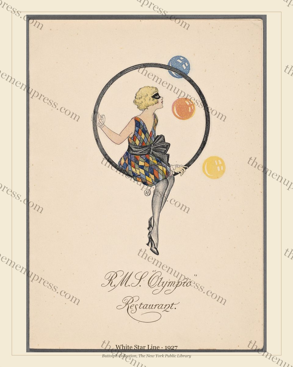
The menu programme moved with this. From around 1922 onwards Cunard cards visibly absorbed Art Deco vocabulary: geometric composition, restrained colour, hand-cut type. The shift was incremental rather than abrupt — Cunard had never been a line that turned hard on visual fashion — but by 1927 the cards on the major Cunarders were recognisably in the inter-war Art Deco register that defined transatlantic dining until the 1929 crash.
The Merger: 1934
The 1929 crash collapsed first-class transatlantic traffic, and the 1924 American immigration quotas had earlier collapsed the third-class market on which the lines had cross-subsidised their first-class loss-leaders. By 1933 both Cunard and White Star were in financial distress. The British government brokered the amalgamation: Cunard-White Star Limited was incorporated in May 1934, with Cunard the majority partner. The two house menu programmes converged thereafter, although individual ship cards continued to carry their original line identity until each vessel was retired.
The merger marks the conventional end of “Cunard Line menus” as an identifiable design tradition. Material printed after 1934 belongs, properly, to Cunard-White Star and then post-1949 to a renamed Cunard Steam-Ship Company. Some of that later work is excellent, but it is no longer the Cunard of the heraldic-crest period or the Edwardian restrained-illustration period or the inter-war Art Deco synthesis. Those traditions ended when the company structure that produced them did.
The Cunard cards in our archive span the 1880–1928 portion of the design history above: the heraldic-restraint period through to the late Art Deco of the merged Cunard-White Star programme. They are catalogued by date and grouped under the Cunard & White Star Heritage bundle.
Frequently Asked Questions
When was the Cunard Line founded?
1840. Samuel Cunard secured a British Admiralty contract to carry transatlantic mail and founded the British and North American Royal Mail Steam-Packet Company, which became known as the Cunard Line. The first sailing was the Britannia from Liverpool on 4 July 1840.
When did Cunard merge with White Star?
Cunard-White Star Limited was incorporated in May 1934, with Cunard the majority partner. The merger had been negotiated through 1933 with British government brokerage; the company itself dates from 1934. In 1949 the combined entity was reorganised back to Cunard Steam-Ship Company.
How are Cunard menus different from the German lines?
Cunard menus are consistently more restrained than the German lines (Hamburg-Amerika, Norddeutscher Lloyd) across the entire Golden-Age period. Cunard preferred embossed heraldic crests over watercolour illustration; preferred anonymous restrained studio work over named-designer commissions; preferred monochrome or sepia over the German chromolithographic palette. This was a deliberate house position rather than an oversight, and it persisted even after Cunard had visible commercial reason to compete on visual flash.
Further Reading
- The Golden Age of Ocean Liner Dining 1880–1930
- White Star Line Menus from Olympic to Titanic (scheduled W9 Tue)
- RMS Olympic 1927: The Last Year of an Art Deco Liner (scheduled W4 Tue)
- John Maxtone-Graham, The Only Way to Cross (Macmillan, 1972)