The 1928 CGT Carte des Vins: Art Deco’s High Point at Sea
TL;DR — The 1928 Carte des Vins from the Compagnie Générale Transatlantique — the French Line — is among the strongest single design objects in the entire Buttolph archive. Issued for first-class service on the line’s Atlantic ships in the year before the 1929 crash, it sits at the precise intersection of mature French Art Deco poster work, the disciplined typography of inter-war wine listing, and the production budgets that still existed in transatlantic dining in 1928. It is the card most often used in modern bar and restaurant interiors when only one piece is hung.
What This Card Is, Precisely
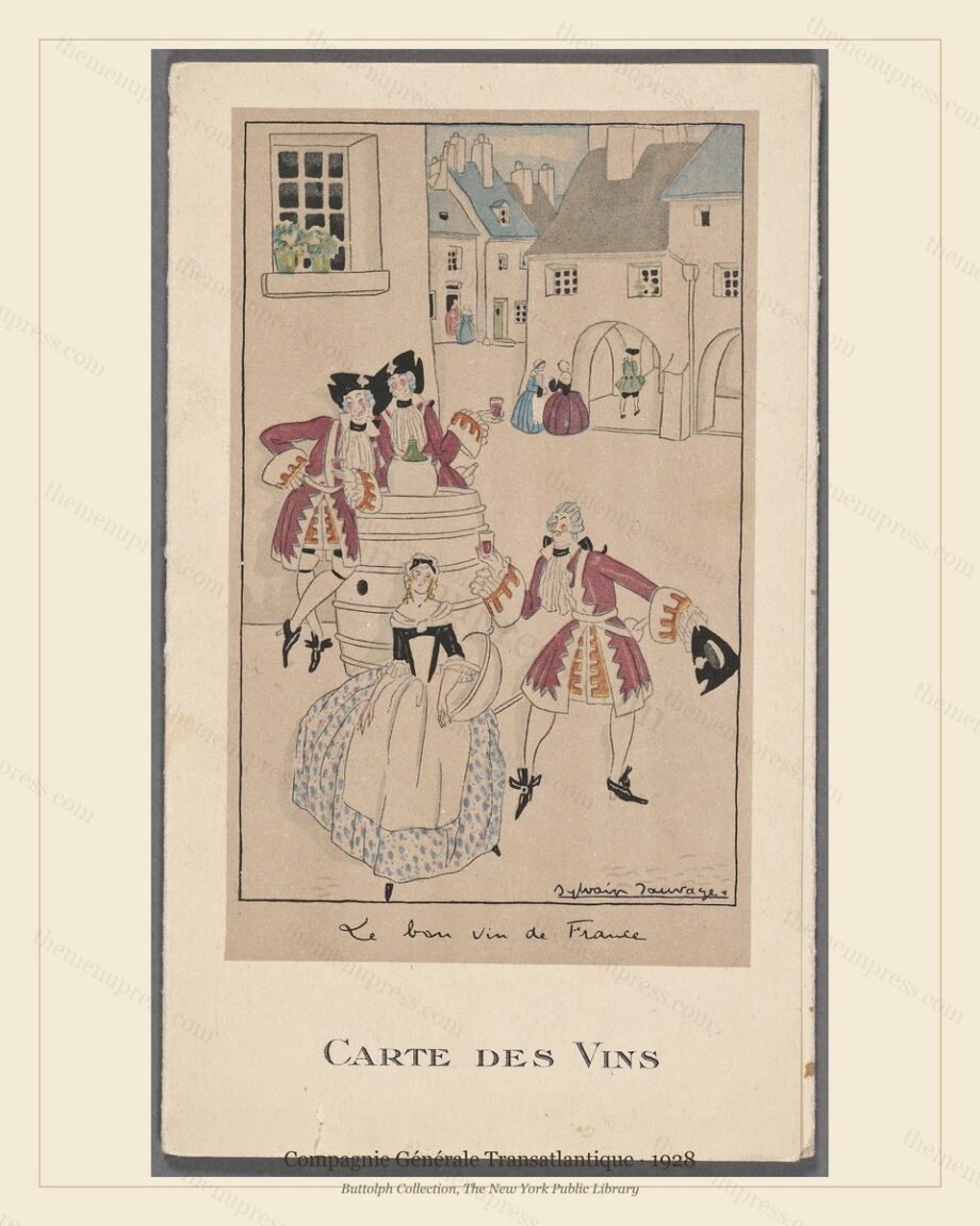
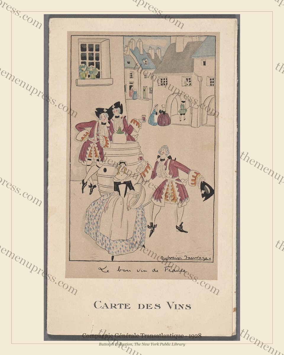
The 1928 Carte des Vins is a stand-alone wine list issued by the Compagnie Générale Transatlantique (CGT, known in English as the French Line) for service in the first-class dining rooms of its Atlantic fleet in calendar year 1928. It was not a daily menu but a wines-only programme — a separate printed object distributed alongside the dinner card. By 1928, the major transatlantic lines had been splitting the menu into multiple cards for roughly a decade; the wine list received the most lavish design budget because wines were where the line earned the highest first-class margins and where house identity was most visible.
The cover is a single composition: a geometric, high-contrast Art Deco arrangement of overlapping fan, vessel, and vine motifs in a restrained palette of ivory, deep red, and matte gold. The typography — the words CARTE DES VINS in disciplined sans-serif capitals — sits on the composition rather than fighting it. The line’s identity is signalled by colour and form rather than by any literal logo. It is, by any reasonable measure, peer work to the great French commercial Art Deco poster output of the same decade (Finamore & Wood, 2017).
Why This Card and Not Another
CGT produced strong design throughout the 1920s and continued to do so into the early 1930s. So why is this specific 1928 issue the one that gets reproduced, hung in bars, and quoted in design-history surveys? Three reasons.
First, it sits at the moment when French commercial Art Deco had matured but had not yet shifted into the more stylised, sleeker, machine-age work of 1932–1935. The 1928 card is recognisably hand-drawn in composition: the geometry is deliberate, but the brushwork that constructed it is still visible. The slightly later CGT cards lose this; the artwork becomes flatter, more mechanical, more obviously the product of a finishing-house. The 1928 issue holds the balance.
Second, it was printed at the very last moment when transatlantic first-class budgets supported full-spectrum production. The chromolithographic registration on this card is exceptional; the ink coverage on the red field is unbroken; the matte gold sits on the ivory without bleeding. After 1929 the lines economised. CGT continued to produce design work, but production values across the industry dropped permanently. The 1928 Carte des Vins is, in printed terms, a peak.
Third, the wine list itself — the contents, inside the cover — is one of the more historically interesting documents of late-1920s European wine commerce. It includes a substantial Bordeaux selection (still the spine of any first-class French dining programme in 1928), a strong Burgundy section, the standard champagne houses, and a small but well-chosen sweet-wine selection. What is striking by modern standards is the price hierarchy: the most expensive single bottle on the list is roughly seven times the cheapest, a far flatter price distribution than any contemporary wine list would carry, reflecting both the smaller spread of available wines and the more restrained pricing conventions of the era.
A Design Reading: What the Cover Does, Element by Element
- Composition: the cover divides the visual field into roughly thirds along a strong diagonal. The Art Deco grammar of the period favoured diagonal partition; this card uses it without resorting to the more aggressive 45-degree slashes that became the cheaper version of the look by 1935.
- Palette: three colours plus paper. The ivory carries warmth (a slightly cream tone, not pure white); the red is deep but not crimson; the matte gold sits between an ochre and an antique brass. Each colour does specific compositional work.
- Typography: the words CARTE DES VINS are set in a custom sans-serif capital with slight geometric narrowing in the letterforms. This was hand-cut for CGT’s 1928 programme by the commissioning print house; it does not appear in any standard 1920s type foundry catalogue.
- Production marks: the printer’s mark sits in the lower-left corner. The registration crosses are barely visible in the unbleached margin. These tell a working print historian that the card was lithographed with three colour stones plus a fourth for the gold, on uncoated paper, in a calendared press run.
Why It Works on a Wall Today
The 1928 Carte des Vins is the card most often chosen by cocktail-bar operators and restaurant designers when the brief is “one piece, hung alone, that anchors the room.” It works in that role because the design was originally conceived for distance reading. It was held at the head of a first-class dining table 30 inches across, and it needed to read clearly to the diner at the far end. That distance-reading discipline survives the scaling to 16×20 inches on a back-bar wall, where a modern patron is 8–15 feet away.
It also works because the colour palette is, by 1920s standards, deliberately restrained. The card carries no orange, no bright yellow, no high-saturation green; the deep red and matte gold are warm without being aggressive. This means the card co-exists with whatever colour scheme is already in the room. It does not fight a green banquette or a black tin ceiling or a champagne-bronze bar back-mirror. Few period cards work this politely; most are louder.
The 1928 CGT Carte des Vins is available as an instant download in three print sizes (8×10, 11×14, 16×20) at 300 DPI, in both a pure version and a museum version with a small caption. It is part of our French Lines bundle, available individually or as part of the Golden Age of Ocean Liner Menus collection.
Frequently Asked Questions
What does CGT stand for?
Compagnie Générale Transatlantique, the French government-subsidised transatlantic shipping line founded in 1864. It is more commonly known in English-language sources as the French Line. The company operated the major French Atlantic crossings — including the celebrated Île de France (1927), Normandie (1935), and after the war the France (1962) — until its absorption into a state-shipping holding in 1977.
Is this an actual historic menu or a designer reproduction?
It is an actual historic menu — a single 1928 issue of the CGT first-class wine list, preserved in the Buttolph Collection at The New York Public Library and digitised by the Library at high resolution. The image we ship has been digitally restored and reformatted for modern printing, but the underlying artwork is the original 1928 design.
What size works best for this piece?
The 16×20 inch print is the canonical size for this card — it was conceived for distance reading and reads at full strength on a back-bar wall, dining-room feature wall, or hotel lobby. The 11×14 reads well in a banquette grouping or in a three- or four-piece chronological sweep. The 8×10 is for intimate spaces only.
Further Reading
- The Golden Age of Ocean Liner Dining 1880–1930
- Designing a Speakeasy Bar Wall with Vintage Menus
- French Line (CGT) and the Art Deco of Dining at Sea (scheduled W13 Tue)
- Daniel Finamore & Ghislaine Wood, Ocean Liners: Glamour, Speed, and Style (V&A Publishing, 2017)