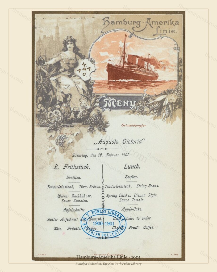
Print & Frame Mastery: The Complete Guide to Vintage Menu Art
TL;DR — The three decisions that determine whether a vintage menu print reads as serious wall art or as a craft-store reproduction are: paper (uncoated matte cotton rag, never glossy), frame (simple wood or aged brass, generous off-white mat, never ornate), and scale (matched to viewing distance, not to wall area). This guide covers each in depth, plus where to print, what to spend, and the four most common errors that ruin otherwise good pieces.
Paper: The Single Decision That Matters Most
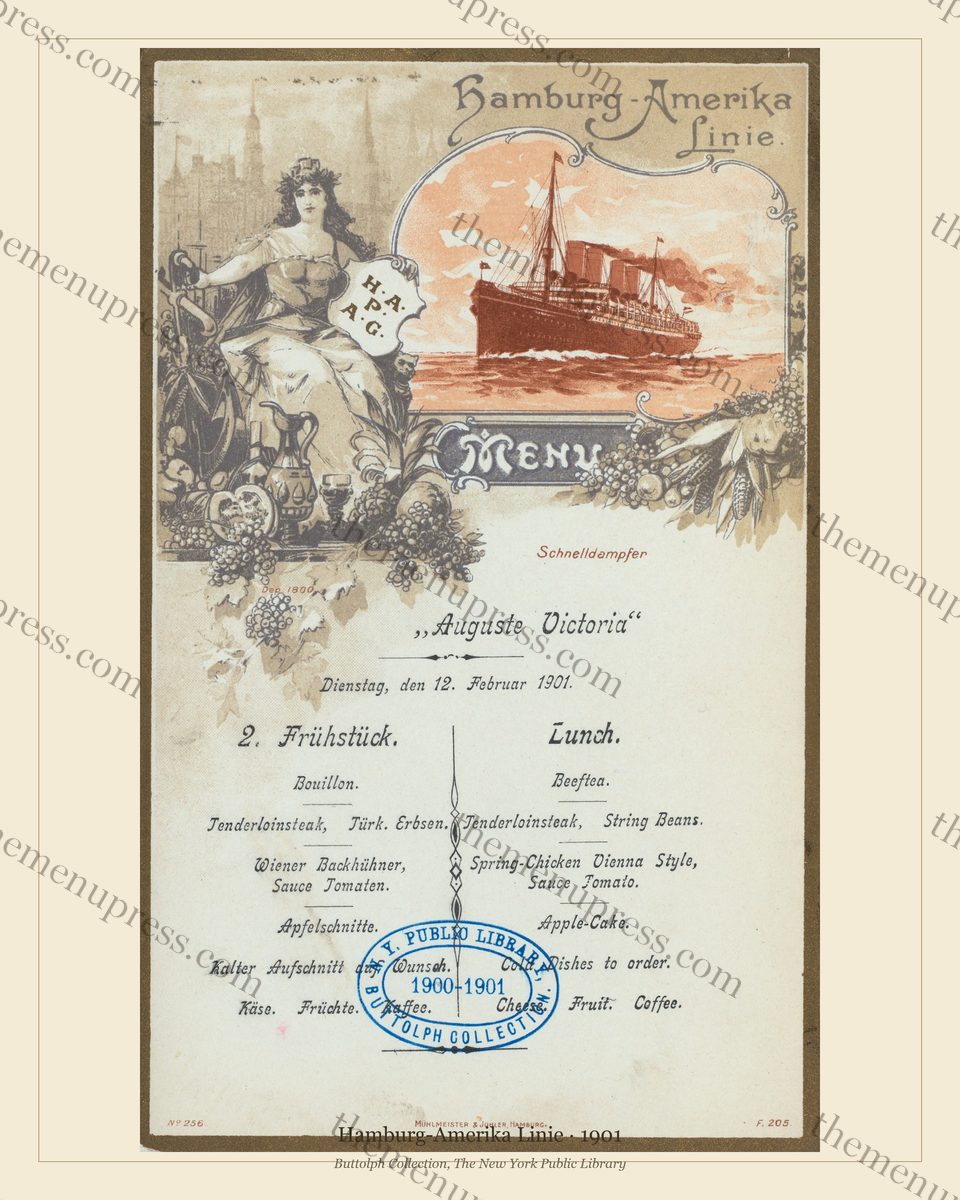
The single decision that does more to make or break a vintage menu print than any other is paper stock. The original cards were printed on uncoated paper: laid stock, wove stock, soft cover stock in the 250–350 gsm range. Watercolour covers sat on absorbent paper that took the ink slightly into the fibre. Lithographic covers were printed on heavier, calendered but still uncoated card. None of them were glossy.
This matters because the surface of the printed paper is doing visual work the eye reads unconsciously. A 1900 watercolour menu cover on glossy modern photo paper looks immediately wrong — the highlights flash, the shadows go dead, the colour relationship the original artist composed for an absorbent surface no longer holds together. A matte cotton-rag paper, by contrast, returns the surface to something close to its native register. The difference between a $20 glossy print and a $30 matte print is not 50% extra cost; it is the difference between a piece that reads correctly and one that does not.
Recommended paper types, in order
- Hahnemühle Photo Rag (308 gsm, 100% cotton, matte). The gold standard for archival fine-art reproduction. Slightly textured, neutral white, accepts wide colour gamut. Available at any serious print shop. Costs roughly 2× standard matte; worth it on the 16×20 pieces.
- Canson Infinity Rag Photographique (310 gsm, cotton, matte). Direct equivalent to the Hahnemühle. Marginally different surface; effectively interchangeable.
- Moab Entrada Rag Natural (290 gsm, cotton, matte, natural white tone). Slightly warmer paper that flatters the ivory tones of older menu covers especially well. Excellent for watercolour-cover material.
- Standard archival matte (200–250 gsm, alpha-cellulose). Fine for 8×10 and most 11×14 pieces. Skip on 16×20 where the cotton-rag papers earn their cost.
- Avoid: anything glossy, photo-lustre, satin, semigloss, metallic, canvas, or “fine art” paper with a heavy texture. All of these fight the original surface.
A short note on home inkjet
Home inkjet is acceptable for personal-use prints up to 11×14, provided you use the heaviest matte photo paper your printer accepts (typically 230–280 gsm matte presentation paper, available at any office-supply store). The output will read correctly on a wall, though it will not match a professional print on cotton rag for archival permanence. For 16×20 statement pieces or any commercial use, send the file to a local print shop or an online archival service.
Where to Print: Three Tiers
Three categories of print provider work for this material. Each is appropriate for a different use.
| Tier | Cost (11×14) | Best for |
|---|---|---|
| Local independent print & framing shop | $40–$80 (print only) or $90–$200 (framed) | Commercial venues, statement pieces, anyone who wants the print + frame done in one place |
| Online archival print service (Mpix, Printique, Bay Photo, WhiteWall) | $20–$50 + shipping | Residential walls, three-piece groupings, anyone comfortable framing themselves |
| Home inkjet (Epson SureColor / Canon PIXMA Pro on heavy matte stock) | $3–$8 in materials | Personal use, prototyping, smaller sizes only |
For commercial venues, the local independent print and framing shop is almost always the right answer despite the higher cost. The reason is not the print — the online services produce excellent prints — but the framing. A local shop will cut the mat to size, fit the glass, mount the print to acid-free backing, and finish the frame in one operation. The total time saved and the consistency of the result across a three- or six-piece installation outweigh the price difference within roughly two pieces.
Framing: Simpler Is Almost Always Right
The instinctive temptation in vintage interiors is to match a 1900 artwork with a 1900-style ornate frame: heavy gilt, carved corners, deep moulding. Resist almost every version of this temptation. The original menu cards were elaborately designed in themselves — that is the whole point of the cover programmes. An ornate frame fights the artwork by adding decorative weight on top of decorative weight. A simple frame allows the artwork to do its own work.
Frame profile and finish
- Profile: thin to medium (under 1.5 inches deep, under 1 inch wide). A boxy moulding rather than an ogee.
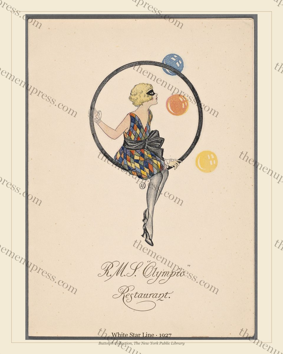
- Finish: dark walnut, dark oak, matte black, or aged brass. For an Art Deco card, brushed brass works. For a watercolour, walnut. For a Royal Yacht engraved card, a thin gilt is period-correct.
- Avoid: high-gloss black (too modern), high-gloss white (too contemporary), distressed white (too country-cottage), heavy gilt (overpowers), ornate carved corners (fights the artwork).
The mat: width matters more than colour
Standard professional matting is 2–3 inches on each side. Below 1.5 inches the print looks cropped and crowded; above 4 inches the frame looks like a hotel-chain art programme. Colour should be off-white (acid-free, archival, with a slight warm tone), not bright white — bright white reads as too modern against the warm ivory of the original cards. Avoid black mats, coloured mats, and double-mat treatments. The artwork already has a printed border; double matting fights it.
Scale: Match the Size to Viewing Distance, Not to the Wall
The most common scaling error is sizing the print to the wall area available rather than to the distance from which it will be viewed. A 16×20 inch print on a wall the viewer stands 30 inches from is overwhelming. An 8×10 print at the end of a long hallway is invisible. The rule of thumb: frame diagonal in inches should equal viewing distance in feet, multiplied by roughly 1.0 to 1.5.
| Print size (in) | Frame diagonal | Ideal viewing distance | Best for |
|---|---|---|---|
| 8×10 | ~13 in | 3–6 ft | Restroom, intimate nook, gallery cluster of six or more |
| 11×14 | ~18 in | 6–10 ft | Banquette wall, three-piece grouping, dining-room cluster |
| 16×20 | ~26 in | 10–20 ft | Back-bar feature, statement piece, hotel-lobby anchor |
The Four Errors That Ruin Otherwise Good Pieces
- Glossy paper. Treated above. Single biggest cause of “this looks like a poster, not a print.”
- Cool-spectrum lighting (4000K+). Daylight LEDs in track lighting or overhead cans make every off-white look grey and every ivory look dingy. Use warm picture lights (2700–3000K) angled at each piece. Where overhead is unavoidable, swap bulbs to 2700K.
- Acrylic glazing instead of glass. Acrylic scratches, attracts dust electrostatically, and yellows over five to ten years. Standard picture-frame glass is fine; museum glass (low-reflection, UV-filtering) is worth the upgrade on 16×20 sizes especially in lit rooms.
- Frame too close to the artwork. Mat below 1.5 inches; print pressed against frame with no breathing room. Reads as cramped and amateurish. Even a 50¢ increase in mat width per side fixes this.
Choosing a piece — each file in our archive ships in three sizes (8×10, 11×14, 16×20) at 300 DPI on the same archival workflow, so the production decisions above apply identically across the collection. The Golden Age of Ocean Liner Menus collection is the densest period of high-resolution material.
Frequently Asked Questions
What is the best paper for printing vintage menus?
Hahnemühle Photo Rag (308 gsm, cotton, matte) is the standard archival choice, used by museums and serious fine-art reproduction shops. Canson Infinity Rag Photographique and Moab Entrada Rag Natural are direct equivalents. For 8×10 and 11×14, a standard archival matte 200–250 gsm paper is acceptable; for 16×20 the cotton-rag papers earn their cost.
What kind of frame should I use for a vintage menu print?
A simple wood frame (dark walnut, dark oak, or matte black) or aged brass, with a generous off-white mat 2–3 inches wide on each side, works in nine cases out of ten. Resist the urge to use period-style ornate gilt frames: they fight the artwork. The single exception is Royal Yacht and state-dinner cards, which were originally distributed in thin gilt and read correctly that way.
How much should a framed vintage menu print cost?
At an 11×14 size, framed and matted by a local independent shop in North America, $90–$200 per piece is typical. With museum-glass upgrade, $130–$260. At 16×20, $150–$300 framed. Online archival print services run roughly half this for the print alone, with framing handled separately.
Can I print these at home?
Yes, at 8×10 and 11×14 sizes for personal use, using the heaviest matte presentation paper your printer accepts (typically 230–280 gsm). Avoid glossy paper. For 16×20 statement pieces or any commercial venue use, send the file to a professional print shop — home inkjets cannot reliably hold colour and detail at that size.
What kind of lighting works best?
Warm-spectrum (2700–3000K), angled, dimmable. Picture lights mounted above each piece are ideal; warm-bulb track lighting angled at 30 degrees works second. Avoid daylight LEDs (4000K and above) and pure-white spectrum overheads — they make off-white papers look grey and ivory tones look dingy. The original cards were viewed by warm low-wattage incandescent and oil lamp; warm lighting returns them to their native register.
Further Reading
- Our short Print & Frame summary — the at-a-glance version of this guide
- Designing a Speakeasy Bar Wall with Vintage Menus — the buyer-side companion pillar
- Best Archival Paper for Vintage Menu Prints (2026 update) (scheduled W6 Fri)
- Frame Styles for Different Menu Eras: A Design Guide (scheduled W9 Fri)
- DIY vs. Local Print Shop: A Cost / Quality Comparison (scheduled W11 Fri)