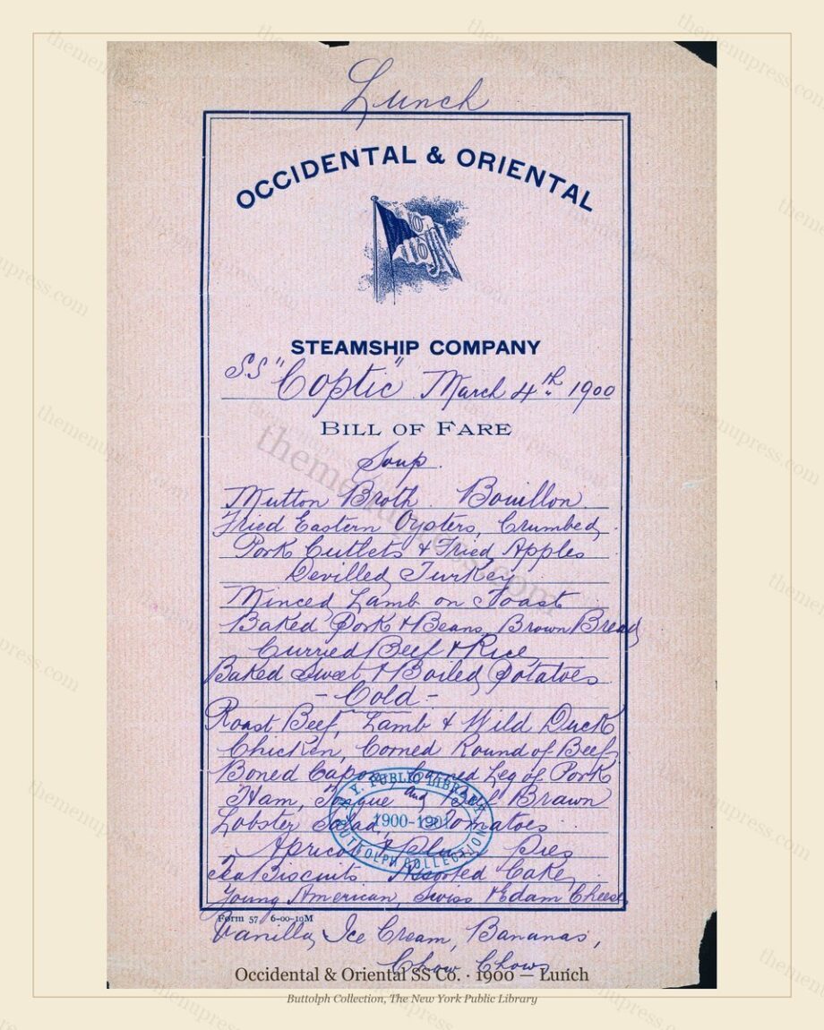
TL;DR — Match the frame to the menu’s era, not to your room: clean, slim metal or black frames suit Art Deco geometry, while warm wood or antique-brass frames flatter the softer lines of Art Nouveau and watercolour covers. A wide cream or linen mat does most of the work in both cases.
By The Menu Press · Published July 2026
Let the mat do the heavy lifting
Whatever frame you choose, a generous mat (2.5 to 4 inches on each side) is what makes a menu print look like gallery art rather than a poster. Use a warm white, cream, or linen mat to echo the aged paper tone; a stark bright-white mat can make the period artwork look slightly grey by comparison. The mat also lifts the artwork off the glass, which protects it and deepens the sense of depth.
Framing Art Deco menus
Art Deco covers (think the 1920s French and British liner cards) are built on geometry, strong diagonals, and disciplined type. They look sharpest in a slim, clean frame: matte black, dark walnut, or a thin metal in brushed brass or pewter. Avoid ornate or heavily moulded frames, which fight the modern lines of the artwork. A simple frame plus a wide mat lets the geometry breathe.
Framing Art Nouveau and watercolour menus
The softer, illustrative covers of the 1890s and 1900s — flowing Art Nouveau borders, watercolour ships and harbours — suit a warmer frame: a medium or dark wood, or an antique gold or brass. A slightly wider, more traditional moulding can work here where it would overwhelm a Deco card. Keep the mat warm and generous so the colours stay the focus.
Frame-by-era cheat sheet:
- Art Deco (1920s): slim black, dark walnut, or thin metal; wide cream mat.
- Art Nouveau (1890s-1900s): warm or dark wood, antique brass or gold.
- Victorian embossed covers (1880s): a touch more traditional moulding is fine.
- Any era: warm-white or linen mat, 2.5-4 inches, museum glass if you can.
Pick a menu and a size, and you can have it framed at a local shop or with a ready-made frame and mat. Browse the archive →
Frequently asked questions
What mat colour is safest?
Warm white, cream, or linen. These echo the aged paper of a period menu and keep the artwork looking warm. A bright cold white can make the original tone look dull.
Should I use non-glare glass?
If the piece will hang opposite a window or under a spotlight, anti-reflective or museum glass is worth it. It cuts glare so the design reads clearly from across the room.
Standard or custom frame?
Our sizes (8×10, 11×14, 16×20) are standard, so off-the-shelf frames and mats fit. Custom framing is worth it for a hero piece you want to anchor a room.
Further reading
The Menu Press curates, digitally restores, and reformats public-domain menus from the Buttolph Collection of Menus, The New York Public Library, for archival-quality printing as wall art. Browse the archive · Read our story.