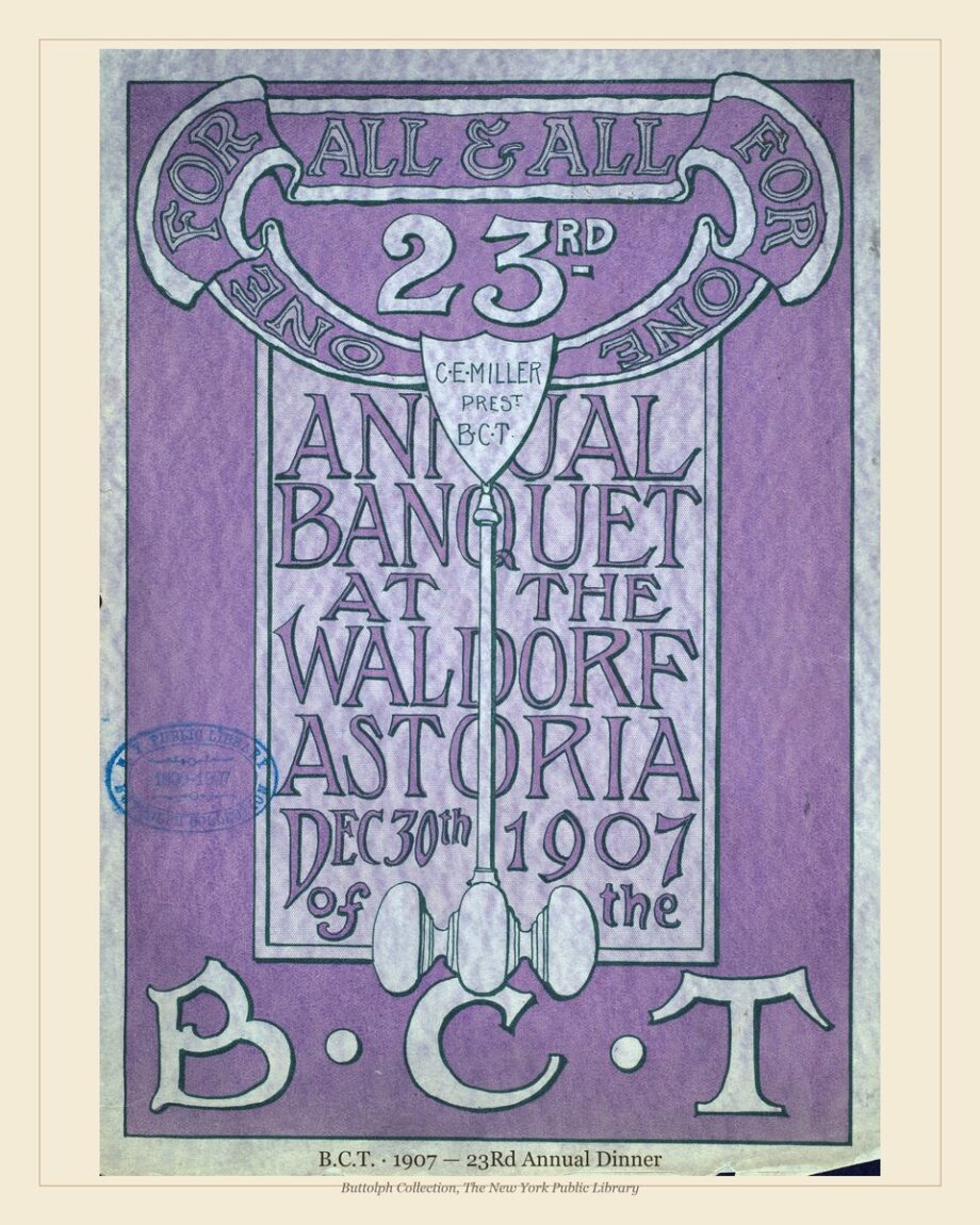
Designing a Speakeasy Bar Wall with Vintage Menus
TL;DR — A speakeasy bar wall succeeds or fails on one thing: whether the artwork reads as curated or as themed. Real archival menus from the 1880–1930 ocean-liner and hotel period beat designer-drawn “vintage-look” reproductions because they carry the visual class signals a 1920s bar would have actually displayed. This guide covers the three layouts that work, the scales and frames that fit each, and the six mistakes that turn an interior into a costume.
Why Most “Speakeasy” Walls Fail
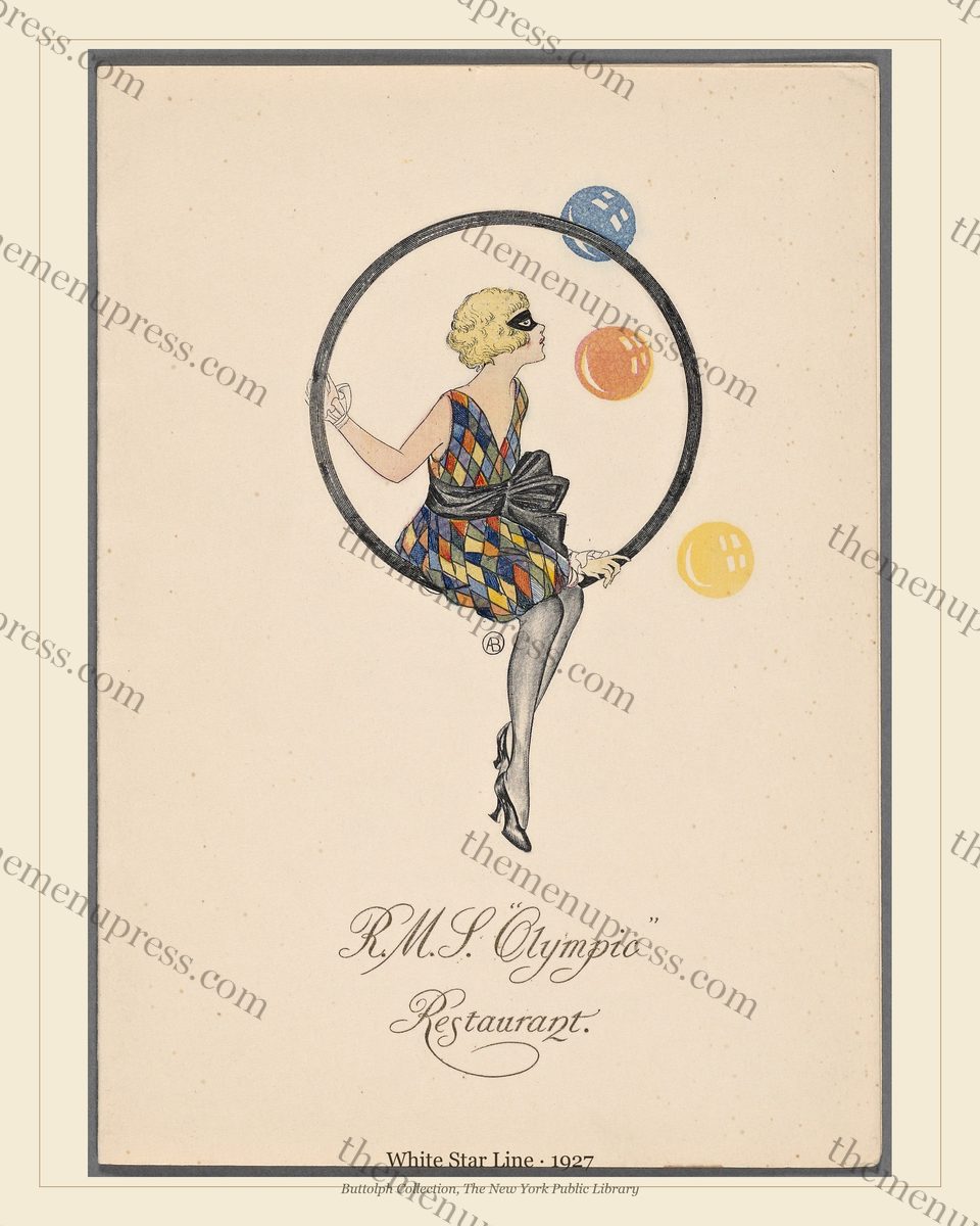
The reason most cocktail-bar walls end up looking themed rather than curated is that the artwork is doing the wrong job. The designer chose a piece because it referenced the 1920s rather than because it was of the 1920s. A vector-illustrated Prohibition-era bottle, an Audrey Hepburn poster, a tin sign reading “BOOTLEGGER” — these decode immediately as decoration about a period. A real menu printed in 1928 decodes as evidence. The difference is the difference between a costume and a coat.
This matters commercially. Patrons who care enough about the room to notice the artwork — the same patrons who order off the back of the cocktail list and stay for two more — can tell the difference between a piece commissioned in 2018 and a piece that was actually held by a passenger in first class on the Olympic in 1927. They may not be able to articulate why one feels right and the other feels approximate, but they choose accordingly.
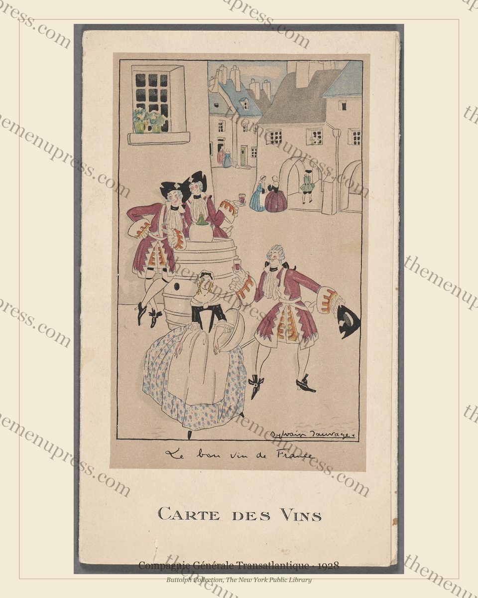
Real archival menus do a second thing reproductions cannot: they carry specific time and place. A real 1928 Carte des Vins from the Compagnie Générale Transatlantique is not “the 1920s” in the abstract. It is a particular wine list, served at a particular Atlantic crossing, by a particular sommelier, in French and English, on uncoated stock pressed by a specific Paris lithographer. That specificity is what curated rooms feel like.
The Three Wall Layouts That Work
Almost every successful menu-led bar wall is a variation on one of three layouts. Choose by room, lighting, and the visual tempo you want the wall to set.
Layout 1: The Single Statement
One large piece, hung alone, framed simply, lit deliberately. This is the most underused option and often the strongest. It works because a bar wall that already carries shelving, glassware, and bottle backlighting does not need a busy gallery installation competing for attention. One large card — typically the 16×20 inch print — reads cleanly from across the room and rewards a closer look from a barstool.
The single statement layout is best with the most graphically resolved cards in the archive: the late Art Deco of the White Star Olympic 1927 or the French Line Carte des Vins 1928. Both of these were designed to read at a distance — they were menu covers held across long first-class dining tables — and they continue to do so on a wall. Mount one above a banquette or behind the back-bar mirror and the room organises itself around it.
Layout 2: The Three-Piece Coherent Grouping
Three pieces from the same line, the same designer programme, or the same five-year window, hung as a tight horizontal or vertical group. This layout reads as a single visual object made of three parts — not as three separate decorations — which is why it works.
The strongest grouping in our archive for this layout is the Hamburg-Amerika watercolour programme of 1897–1906 (Finamore & Wood, 2017). Three or four of these covers hung side by side at 11×14 inches read as a coherent painterly suite. The colour palette is consistent (soft maritime blues, ochres, faded golds), the period is tight, and the line’s identity unifies them. The result is a wall that reads as “an early-twentieth-century European hospitality collection,” not as “three random old menus.”
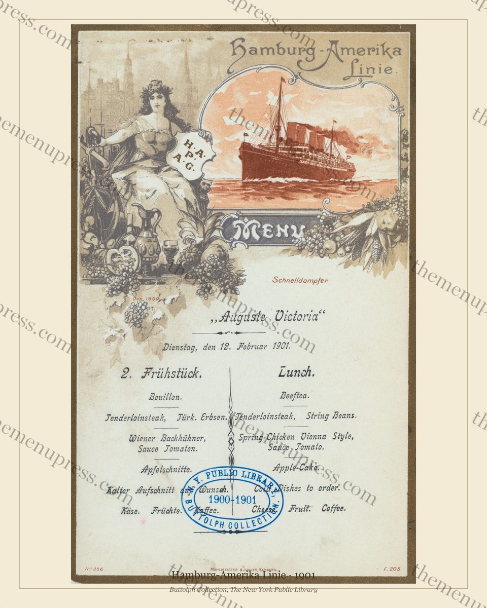
The same logic applies to grouping three Cunard menus from the embossed-crest period (1880s–1900s), or three NDL Bremen harbour-scene cards, or three Royal Yacht engraved cards. The rule of thumb: shared line + shared design idiom + window of less than fifteen years. Mixing eras inside a three-piece grouping breaks the visual logic.
Layout 3: The Chronological Sweep
Five to seven pieces, one per decade or one per major era, hung in a horizontal sweep across a long wall. This layout works only on a wall that can give it the space (typically eight running feet or more), and it works only if the order is legible from a single position in the room.
The strongest chronological sweep we can build from the archive is a sequence like: 1882 Cunard dinner card → 1897 Hamburg-Amerika Auguste Victoria → 1901 NDL Harbour Scene → 1906 Royal Yacht state dinner → 1927 White Star Olympic → 1928 CGT Carte des Vins. That is fifty years of transatlantic dining, visible as a wall.
This is the layout most often used by hotel lobbies, restaurant entrance corridors, and bars that double as wine-and-cheese rooms or hotel libraries. It works because it gives the patron something to read, not just something to look at. They can walk the wall in order. The room becomes a small museum that happens to also serve drinks.
Scale, Framing, and Lighting
The technical decisions on scale and framing are simpler than they look, but the wrong choice undoes everything else. Three rules.
Scale: the print size by use
| Use | Print size | Notes |
|---|---|---|
| Behind the bar back-counter, above bottle shelving | 16×20 in | Reads at distance; competes with backlit glassware |
| Banquette wall, three-piece grouping | 11×14 in each | Standard “gallery” size; pairs with off-white mat |
| Hallway / hotel corridor / chronological sweep | 11×14 in | Allows comfortable reading distance for walking patron |
| Restroom / private dining room / cocktail nook | 8×10 in | Intimate spaces need smaller pieces; otherwise the wall shouts |
Frame: simpler is almost always right
The reflexive instinct in vintage interiors is to match a 1920s artwork with a 1920s-style ornate frame. Resist. The menu cards were already elaborately designed objects; an ornate frame fights them. A simple wood frame — dark walnut, dark oak, or aged brass — with a generous off-white mat works in nine cases out of ten. Museum glass (low-reflection) is worth the upgrade on the 16×20 sizes; it removes glare from sconces and pendant lighting.
The single exception is the Royal Yacht and naval state-dinner cards, which were originally distributed framed in heavy gilt. For those, a thin gilt or aged brass frame is period-correct and reads well in a bar with brass fixtures. For everything else — the ship cards, the hotel banquets, the watercolours — keep the frame quiet.
Lighting: warm, angled, dimmable
The single most common failure mode in venue lighting for menu prints is washing them with too-cool overhead light. Real menus were viewed by oil lamp, gas lamp, or low-wattage incandescent in 1900–1930. A warm-spectrum picture light (2700–3000K), mounted above each piece and angled to hit the top third of the card, returns the artwork to something close to its native light. Avoid daylight LEDs (4000K and above): they make every off-white paper look grey and every ivory look dingy.
Six Mistakes That Sink a Menu Wall
- Mixing real and fake. One archival card next to three reproduction prints reads as four reproductions. Either commit fully to archival material or do not put real cards on the wall at all.
- Hanging at home-decor height (centre 60 inches off floor). Bars are vertical rooms with patrons looking up from stools. Hang centres at 64–68 inches.
- Crowding three pieces too far apart. A three-piece group should sit with 2–3 inches between frame edges, not 6 or 8. Wide spacing destroys the “single object made of three parts” effect.
- Mat width that fights the card. Off-white mat 2 to 3 inches wide on each side reads as professional. Skinny mats (less than an inch) look cheap; oversized mats (4 inches plus) make the room feel like a hotel-chain art programme.
- Glossy paper. The original cards were uncoated. Glossy reproductions look immediately wrong, regardless of how good the underlying file is. Print on matte or natural-white cotton-rag stock only.
- Captioning the wall. A small typeset card next to each piece explaining the date and ship is a museum signal that does not belong in a bar. If you want patrons to know the provenance, let them ask. Curated bars are quietly curated.
Putting It Together: A Budget Reality Check
Building an archival-menu bar wall is one of the lowest-cost serious interior upgrades available to a hospitality operator. A representative breakdown, for a North American venue commissioning a local print and framing shop:
| Component (per piece, 11×14 in) | Cost range (USD) |
|---|---|
| Digital file (single menu, archival quality) | $8–$15 |
| Archival matte print at local shop | $20–$40 |
| Mat board, cut to size | $10–$25 |
| Simple wood or brass frame | $30–$80 |
| Museum glass upgrade (optional) | +$25–$60 |
| Total per piece, framed and matted | $70–$160 |
A three-piece coherent grouping runs $210–$480 framed. A chronological sweep of six pieces, $420–$960. A single 16×20 statement piece, often $130–$240. Compared with commissioned vintage-style wall art (typically $400–$1,500 per piece) or with hospitality interior consulting firms’ standard wall-art line items ($1,200–$4,000 per linear wall), this is a small fraction of the cost for what is, in our view, materially better outcome.
Building your wall — the archive is organised by line and by period so you can choose pieces that match one of the three layouts above. The most-requested starting points for cocktail-bar interiors: the Olympic 1927, the CGT Carte des Vins 1928, and a three-piece Hamburg-Amerika watercolour grouping.
Frequently Asked Questions
Can I use these in my commercial venue?
Yes. The original artworks are in the U.S. public domain. You may print and display them in your bar, restaurant, hotel, or other commercial premises, including for paid-admission spaces. You may not resell the digital files or claim authorship of the originals. See our Copyright Notice for the full position.
How many pieces do I need for a bar wall?
One large statement piece at 16×20 inches is enough to anchor a back-bar wall. A three- or four-piece grouping at 11×14 inches works for a banquette or feature wall. A chronological sweep of five to seven pieces needs eight running feet of wall or more. There is no minimum — one well-chosen and well-framed real menu beats a wall of six reproductions.
Does this work for restaurants, not just bars?
It works particularly well for restaurants, and especially for restaurants with a clear period or regional identity (French bistro, hotel grill, oyster bar, classic American steakhouse). The three layouts apply the same way. The one adjustment: in dining rooms, hang slightly lower (centres at 60–62 inches) since seated patrons are the primary viewer.
Does this work in a home bar or den, or only in commercial venues?
Yes — in fact, the three-piece coherent grouping is the most popular residential choice, typically in home bars, billiard rooms, libraries, or formal dining rooms. The single-statement layout reads especially well in a home library or study. Residential interiors can also accept slightly more ornate frames than commercial bars, where simplicity is usually the safer choice.
Can I mix decades within one wall?
Within a chronological sweep, yes — that is the entire premise of the layout. Within a three-piece grouping, no — the visual logic depends on a unified period and design idiom. The rule: mix eras only when the order across the wall tells the time sequence.
Further Reading
- The Golden Age of Ocean Liner Dining 1880–1930 — the historical pillar this guide complements
- Frame Styles for Different Menu Eras: A Design Guide (scheduled W9 Fri)
- How to Build a 6+ Menu Wall: Group Hanging Mastery (scheduled W14 Fri)
- Where to Print Vintage Menus: A Guide for Restaurant Owners (scheduled W5 Fri)
- Daniel Finamore & Ghislaine Wood, Ocean Liners: Glamour, Speed, and Style (V&A Publishing, 2017)