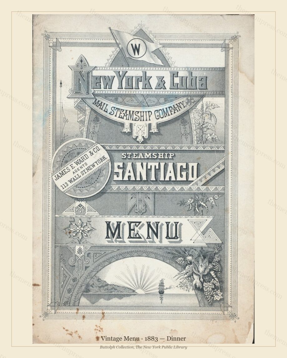
TL;DR — For vintage menu prints, a heavyweight matte or lightly textured fine-art paper (around 230-310 gsm) gives the closest match to the original period card and the longest-lasting result. Glossy photo paper fights the antique look; thin office paper looks cheap behind glass. Below: what to ask a print shop for, and how to get it right at home.
By The Menu Press · Published July 2026
The short answer
A vintage menu was printed on uncoated or lightly coated stock, so it reads best on paper with a similar surface: a matte or velvet fine-art paper, heavy enough to feel substantial behind a mat. Aim for 230-310 gsm. Avoid high-gloss photo paper, which adds a modern sheen the original never had, and avoid thin copy paper, which buckles and looks flat behind glass.
What to ask a print shop for
If you are using a local shop or an online lab, ask for a giclee or archival pigment print on a matte fine-art paper. Cotton-rag papers (such as the common ‘hot press’ and ‘cold press’ fine-art stocks) are the most archival and hold deep blacks and warm paper tones well. A smooth matte photo paper is an acceptable budget step down. Specify ‘no gloss’ and ‘true to file colour, no auto-correction’ so the lab does not brighten the period tones.
Printing at home
A home inkjet with pigment inks and a matte fine-art setting handles 8×10 and 11×14 sizes nicely. Load a single sheet of matte presentation or fine-art paper rather than glossy photo paper, set the printer to its highest quality and the correct paper type, and print at 100% scale with no fitting. Our files are 300 DPI, so they hold detail at every size we offer.
A quick checklist before you print or order:
- Matte or velvet surface, not gloss.
- Weight around 230-310 gsm so it sits flat behind a mat.
- Print at 100% scale, true to file, no auto-enhance.
- Warm white or natural paper tone flatters the period artwork.
Every menu in the archive ships at 300 DPI in three sizes (8×10, 11×14, 16×20), ready for any of the papers above. Browse the archive →
Frequently asked questions
Is glossy paper ever a good idea?
Rarely, for this kind of art. Gloss adds reflections and a contemporary sheen that work against the antique character of a period menu. A matte or velvet surface looks more like the original and is easier to light without glare.
What weight should I choose?
Around 230-310 gsm is the sweet spot: heavy enough to feel like art and sit flat behind a mat, light enough for a home printer or a standard frame. Heavier cotton-rag papers are the most archival.
Will the file hold up at 16×20?
Yes. Files are prepared at 300 DPI for the listed sizes, so the 16×20 prints crisply on fine-art paper.
Further reading
The Menu Press curates, digitally restores, and reformats public-domain menus from the Buttolph Collection of Menus, The New York Public Library, for archival-quality printing as wall art. Browse the archive · Read our story.